Fitness App
Mobile app for sports gym. Focus on training schedules and subscription plans
Role
Branding & Ui design
Timeline
Early 2021

Introduction
In order for a gym to work properly different parameters need to be aligned
Being a boxing and kickboxing athlete myself, I alwayswanted to create an app that would concentrate my training schedule, a timer, a collection ofmy stats during my training,but also would make me easily pay my subscription and finda sparring partner.
Branding & Naming
The Name
The name is simply the surname of theinstructor which also is the name of the team.
The Design
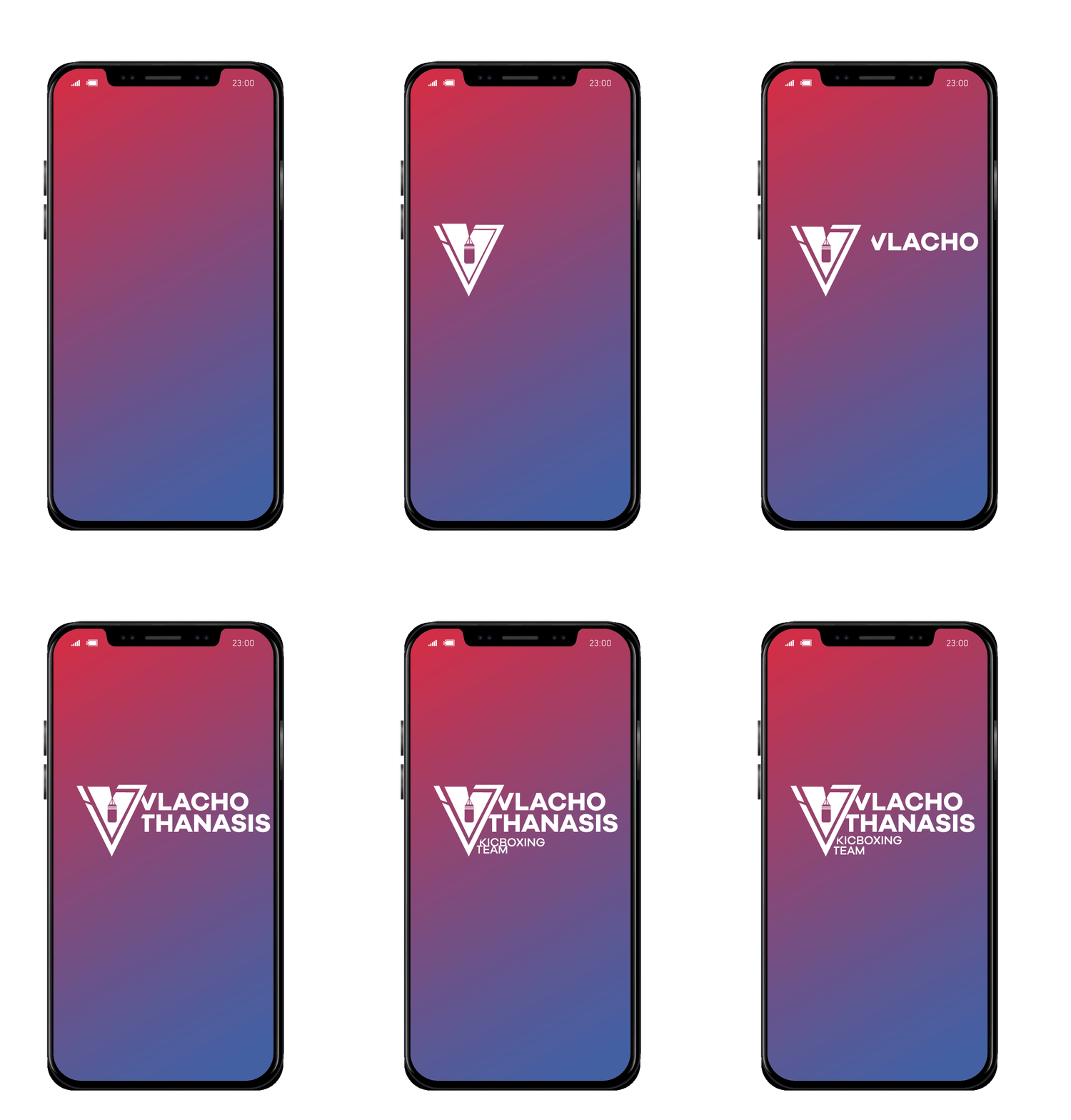
The logo consists of an icon in the form of a V from the first letter of the surname Vlachothanasis, and inside there is a heavy bag hanging. I wanted to create a bold symbol that also resembles a bit a shield, to emphasise on the self defence you learn from the sport but the V is also pointy to show that you can mainly defence but also attack like a pointy edge of a spear.The typography of the logo is also bold to match the icon.


Ui & Visual Design
Typography
The font chose for this app is the Acumin Variable font.
Acumin is a versatile sans-serif typeface family designed by Robert Slimbach, intended for a balanced and rational quality. Solidly neo-grotesque, it performs beautifully at display sizes but also maintains an exceptional degree of sensitivity for text sizes.
H1: Acumin Variable Concept Cond. Bold - 28 pt
H2: Acumin Variable Concept Cond. Bold - 21 pt
Button: Acumin Variable Concept Cond. Bold -19 pt
H3 - Icon titles : Acumin Variable Concept Cond. - 20pt
H4 - Icon titles : Acumin Variable Concept Cond. - 12pt

Colour
The colours used are red & blue.
These colours represent the red and blue that the two sides wear in the ring

Icons
Icons were used throughout the web-app, following the colour scheme so nothing looks out of place.


